Editing and layout are two of the most important things when finalizing a political push piece. You need to be shrewd enough to know how much information you need to edit out and then have the eye to know where to place what remains. This flyer is a good example of editing out enough content, but needs work on the layout of everything that remains.
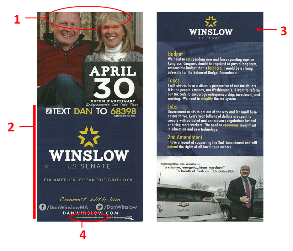
This placement problem is most clearly demonstrated by the candidate portrait on the front of the flyer. The picture of Winslow and his wife is an excellent photo and portrays someone who is family oriented, relaxed (due to attire), with a warm smile. The problem with this photo is that it is chopped off just above the candidate's brow line (1). As soon as you see this, you have to assess what is listed below to determine if it is worth cramming the photo so much.
Underneath the picture (2) you find the date of the election, campaign logo, campaign motto, texting information, Facebook info, Twitter info, and website. The two most important things are well defined, the election date and the logo. In most circumstance the election date does not have be so pronounced, but since this is a special election primary, accentuating this is almost mandatory. You always want to encourage people to connect with your campaign, but to keep the design clean it is sometimes better to list the most important way to connect while listing the rest of the information on the back of the flyer. On this card I would have suggested moving some of the connection information to the back of the flyer which would enable me to clean up everything else.
The back of the flyer is fairly clean and I love the use of effective white space around the logo (3). This really makes Winslow's name stand out which is exactly what you want on both sides of the flyer. The picture of Dan next to his electric car showcases many images that tells you a lot about the candidate (including a red, white, and blue ribbon!). To address the concerns I have with the front of the flyer there are many things you can condense or edit out to include a tidy "connect" section.
One last thing to note. When I work with graphic designers on flyer designs I always ask them to use the smallest font size possible for the "Paid for by the committee..." disclaimer to save room for more important things. It looks like Winslow's designer got the same marching orders since his disclaimer is almost microscopic (4).
The Good
1. White space around logo
2. Pictures with multiple messages
3. Appropriate amount of information
The Bad
1. Photo on front is cramped
2. Information on front could be better spaced
3. N/A
Overall Rating: B
 RSS Feed